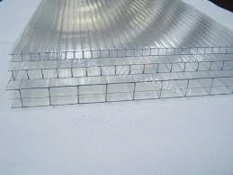
Multiwall Polycarbonate Sheets
Ireland Best Price Multiwall Polycarbonate Sheets Provide and Services. Up to 200 Times Stronger Than Glass. WE Pay VAT, you save 23%/Order. Free Cut to Size Service. Biggest Size: 7000mm x 2100mm thickness 10mm, 16mm, 25mm, Colours: Clear, Bronze. From Only €32 BUY NOW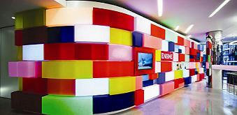
Acrylic Perspex Sheets
Ireland Best Price Acrylic Perspex Sheets Provide and Services. WE Pay VAT, you save 23%/Order. Free Cut to Size Service. Biggest Size: 3050mm x 2050mm thickness 3mm, 5mm, 6mm, 8mm, 10mm. Colours: Clear, Yellow, Orange, Red, Green, Black, Opal, Glasslook. From Only €29. BUY NOW
Polythene Cover
Ireland Best Price Polythene Cover Provide and Services. WE Pay VAT, you save 23%/Order. Free Cut to Size Service. Wide Size: 8m, 9.2m, 11m, 14m. Cut to Length. Colours: Clear. Thickness: 800 Gauges.From Only €64.50. BUY NOW
Hygienic Wall Cladding
Ireland Best Price Hygienic Wall Cladding Provide and Services. WE Pay VAT, you save 23%/Order. Free Cut to Size Service. Biggest Size: 3050mm x 1220mm. Colours: White.From Only €37. BUY NOW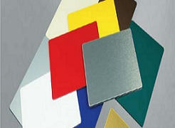
Dibond Aluminium Sheets
Ireland Best Price Dibond Aluminium Sheets Provide and Services. WE Pay VAT, you save 23%/Order. Free Cut to Size Service. Biggest Size: 3050mm x 1500mm. Colours: Standard Colours Available.From Only €55. BUY NOW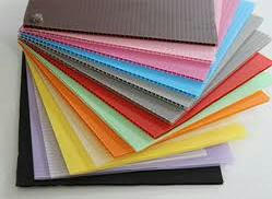
Corriboard Sheets
Ireland Best Price Corriboard Sheets Provide and Services. WE Pay VAT, you save 23%/Order. Free Cut to Size Service. Biggest Size: 2400mm x 1220mm thickness 3mm, 4mm, 5mm, 6mm, 10mm. Colours: Standard Colours Available.From Only €5.90. BUY NOW
14 Dec 2014
13 Dec 2014
Free Online Web Courses
Web Development
Why Take This Course?
In this project-based course your knowledge will be evaluated as you
learn to build your own blog application! Learn everything Steve Huffman wished
he would have known when he broke into the startup world. Read more about
Huffman and the course here.
Prerequisites and Requirements
A moderate amount of programming and computer science experience is
necessary for this course.
What Will I Learn? Projects
Make a webpage that anyone can add to and edit.
Syllabus
How the Web Works
Introduction to HTTP and Web Applications
How to Have Users
Getting and processing user input
How to Manage State
Databases and persistent data
Whom to Trust
User authentication and access control
How to Connect
Web applications as services, using APIs
How to Serve Millions
Scaling, caching, optimizations
Changing the World
Building a successful web application, project
Go To Class
Semantic Web Technologies
In this course, you will learn the
fundamentals of Semantic Web technologies. You will learn how to represent
knowledge and how to access and benefit from semantic data on the Web.
Syllabus
- Week
1: Introduction
to the Semantic Web
- Week
2: Identifying
Things with URI and RDF
- Week
3: Querying
RDF(S) with SPARQL
- Excursus: Semantic (Meta) Data and the Web
- Week
4: Knowledge
Representation I
- Week
5: Knowledge
Representation II
- Week
6: Applications
in the Web of Data
- Final
Exams: Final Exams
Go To Class
Mobile Web Development
What Will
I Learn? Projects
Design and build a mobile app that
takes advantage of touch screen functionality.
Syllabus
In this course, you will learn how to
build web experiences that adapt to the different screen sizes and capabilities
that mobile devices offer, and how to scalably optimize media for mobile and
desktop. We will cover programming touch interaction, as well as how to
optimize form field input for mobile devices and use APIs like geolocation and
the accelerometer, and ensuring your web experiences work great when network
conditions are sub-optimal. Finally, you’ll gain the tools to investigate
performance in mobile applications, with a strong understanding of mobile
networking, battery usage patterns and optimizing paint techniques to build
smooth animations on mobile.
Lesson 01:
Syllabus
We’ll start with a high-level overview
of the course and what to expect in it. We’ll also go into more depth on what
we mean by mobile web development, and why you should care about it.
Lesson 02:
Mobile Development Tools
Workflow and tooling is incredibly
important for building great web apps, and this carries over to mobile web
development. This lesson will show you how to use the Chrome Developer Tools to
develop for the mobile web.
Lesson 03:
Mobile UX and Viewport
Designing for the mobile web is all
about a smooth user experience. This lesson will get you thinking about how to
achieve that on mobile, and we’ll introduce the first of many tools you need to
achieve this: the viewport.
Lesson 04:
Fluid Design
Mobile means lots of different devices
and form factors. We’ll discuss how to make your site responsive, clean, and
user-friendly on multiple devices and layouts.
Lesson 05:
Media Queries
Sometimes different devices call for
fundamentally different layouts. This lesson will teach you how to achieve this
using media queries.
Lesson 06:
Responsive Images
Media requirements are different in
mobile - network constraints and very high resolution screens set up a conflict
that can be challenging. We’ll talk about how best to integrate media into your
mobile web applications, and adaptively scaling images based on the environment.
Lesson 07:
Optimizing Performance
Users expect a fast, seamless
experience on mobile. We’ll go over optimizing various performance metrics to
improve that experience, such as network, cpu, rendering, and battery
performance.
Lesson 08:
Touch
Touch input is fundamentally different
from mouse input, and requires you to think about your user interactions
differently. We’ll go over UX concerns with touch-based interaction, and how to
design user interactions that work across devices.
Lesson 09:
Input
Using a keyboard on mobile is awful.
We’ll discuss ways to improve it, using semantic input for form data, and other
user input options on mobile.
Lesson 10:
Device Access
Mobile devices have a full array of
sensors typically unavailable on desktop. We’ll talk about camera access,
geolocation, and other sensors and feedback you have access to on mobile.
Lesson 11:
Offline and Storage
It’s an unfortunate reality that mobile
users aren’t always online. We’ll go over using the local cache as well as
local storage APIs to give your users a great offline (and partially-online)
experience as well.
Lesson 12:
Wrap-up
We’ll finish up the class by talking
briefly about other topics to consider, such as app experience, monetization,
deployment and distribution. We’ll also point you to other resources to look at
moving forward in your career.
Go To Class
User Experience for the Web
What will I learn?
- The
characteristics of user experience design, usability, and user centred
design
- The
factors that influence interface design, and how to balance these
requirements
- The
design streams that impact interface design, and design techniques from
each stream:
- Information
Design
- Interaction
Design
- Visual
Design
- How
branding is an important part of user experience
- The
importance of accessibility online
- The
importance of knowing your users and:
- What
you need to know
- How
to learn about them
- How
to communicate your findings
- Key
usability evaluation techniques, including:
- Walkthroughs
- Usability
testing
- Expert
review
- Competitor
analysis
This course requires approximately 2 - 4 hours of study per week, but
can vary depending on the student. This includes watching videos, and taking
quizzes and assessments.
If you pass this course you'll receive a Certificate of Achievement.
While this certificate isn't a formal qualification or credit, you can use it
to demonstrate your interest in learning about this area to potential employers
or educational institutions.
Where could this lead me?
If you're wondering what your future could look like in this area, here
are some potential careers you could head towards.
- Social
media manager
- Web
designer
- Web
developer
- Web
publisher
- Webmaster
- Assistant
web designer
- Assistant
web designer
- Technical
writer
- Website
coordinator
- Webmaster
assistant
Go To Class
Knowledge Engineering with Semantic Web
Technologies
In this course, you will learn the fundamentals of Semantic Web
technologies and how they are applied for knowledge representation in the World
Wide Web. You will learn how to represent knowledge with ontologies and how to
access and benefit from semantic data on the Web. Furthermore, you will also
learn how to make use of Linked Data and the Web of Data, currently the most popular
applications based on Semantic Web technologies.
Requirements for this course:
- a
basic knowledge of the foundations of mathematical logics, i.e.
propositional logics and first order logics
- a
basic understanding of web technologies, such as URL, http, HTML, and
XML-based technologies
- a
basic knowledge of database technology, esp. relational databases
and SQL query language
Syllabus
·
- Week
1: Knowledge
Engineering and the Web of Data
- Week
2: Semantic
Web Technologies - Part 1
- Week
3: Semantic
Web Technologies - Part 2
- Week
4: Knowledge
Representation - Part 1
- Week
5: Knowledge
Representation - Part 2
- Week
6: Knowledge
Engineering
- Final
examination: Final
examination
Go To Class
Intro to HTML and CSS
Why Take This Course?
Front-end Web Developers must have a fundamental understanding of HTML
and CSS which we’ll accomplish in this course by converting digital design
mockups into static web pages. To build the web pages you will use HTML, CSS,
and take advantage of the Bootstrap, the popular Twitter framework.
After completing this course you will be able to build a responsive
portfolio site, with your own CSS framework, with the functionality to add your
future projects to it. Most importantly, you will have an understanding of the
DOM and how HTML, CSS, and JavaScript all relate to each other.
This course's project is part of our Front-End Web Developer Nanodegree.
Projects
Take a design mockup as a PDF-file and
replicate that design in HTML and CSS.
Syllabus
Lesson 1 -
From Design to Code
Diligently employ a code/test/refine
strategy as you precisely and deliberately translate initial design documents
into static web pages. You'll also investigate the Document Object Model (DOM)
and its implications for web development.
Lesson 2 -
Your Own Framework
Take pride in creating and
personalising your own multi-platform, responsive CSS framework for publishing
your professional portfolio projects to the web.
Lesson 3 -
Learning and Using Bootstrap
Strategically investigate an existing
professional CSS framework as you use it to build a website using responsive
design principles while maintaining code readability.
Object-Oriented JavaScript
Why Take This Course?
As a Front-End Web Developer, JavaScript is one of the most important
languages in your toolbox. A strong foundation in the language’s features
empowers you to write efficient and performant web applications. In this course
you’ll explore a variety of ways to write object-oriented code in JavaScript.
You’ll build a variety of JavaScript objects and explore how their
different inheritance models affect your code’s execution and in-memory model.
You’ll use these features to write memory efficient code and seek simplicity
and modularity in your own code.
Projects
Use your object-oriented JavaScript skills to develop a performant,
organized and easily maintainable version of the classic arcade game, Frogger.
Syllabus
Lesson 1: Scopes and
Closures
Lesson 2:
The Keyword “this”
Lesson 3:
Prototype Delegation
Lesson 4:
Code Reuse
Go To Class
8 Dec 2014
Create a Customized Three Column Footer Widget In Blogger
 You might have seen a three column widget at the bottom section of many
commercial and professional blogs. Where you can add whatever stuff you
like. Take my footer widget as an example. I have added widgets that
further keeps the reader busy. This Footer widget contains three columns
where each column can accommodate as many widgets as you can add! In
order to add such a widget to the bottom section of your blogs and also
customize the look and feel of it then lets start learning today’s
tutorial.
You might have seen a three column widget at the bottom section of many
commercial and professional blogs. Where you can add whatever stuff you
like. Take my footer widget as an example. I have added widgets that
further keeps the reader busy. This Footer widget contains three columns
where each column can accommodate as many widgets as you can add! In
order to add such a widget to the bottom section of your blogs and also
customize the look and feel of it then lets start learning today’s
tutorial.See a screenshot,

Add This Three Column Widget Inside Your Blogger Templates
Follow these steps,- Go To Blogger > Layout > Edit HTML
- Back Up your template
- Search for ]]>
/* ----- LOWER SECTION ----- */
#lower {
margin:auto;
padding: 0px 0px 10px 0px;
width: 100%;
background:#333434; }
#lower-wrapper {
margin:auto;
padding: 20px 0px 20px 0px;
width: 960px;
}
#lowerbar-wrapper {
border:1px solid #DEDEDE;
background:#fff; float: left;
margin: 0px 5px auto;
padding-bottom: 20px; width: 32%; text-align: justify;
font-size:100%;
line-height: 1.6em;
word-wrap: break-word;
overflow: hidden;
}
.lowerbar {margin: 0; padding: 0;}
.lowerbar .widget {margin: 0; padding: 10px 20px 0px 20px;}
.lowerbar h2 {
margin: 0px 0px 10px 0px;
padding: 3px 0px 3px 0px;
text-align: left;
color:#0084ce; text-transform:uppercase;
font: bold 14px Arial, Tahoma, Verdana; border-bottom:3px solid #0084ce; }
.lowerbar ul {
margin: 0px 0px 0px 0px;
padding: 0px 0px 0px 0px;
list-style-type: none;
}
.lowerbar li {
margin: 0px 0px 2px 0px;
padding: 0px 0px 1px 0px;
border-bottom: 1px dotted #ccc;
}
5. Now Search For
and just above this code type the codes below,
6. Save your template. done!
Now visit the page Layout > Page Elements and start adding widgets!
Customization
You can easily customize the look and colours of the this footer widget. I have bolded the important parts in the CSS code above. Read the descriptions below carefully to better stylize your three column widget. For changing colours use our advanced Colour Code Generator- background:#333434; Changing the six digit colour code will change the background colour of this widget.
- width: 960px; This is the width of the widget. If you want you can adjust this width value in accordance with the width of your blog.
- background:#fff; and width: 32%; is the background colour and width of the three columns where the widgets are added.
- color:#0084ce; This is the Colour of Title Headings
- font: bold 14px Arial, Tahoma, Verdana; Edit this to change the font size and family.
- border-bottom:3px solid #0084ce; Edit this to change the thickness, style and colour of the border that appears at the bottom of Title Heading
- border-bottom: 1px dotted #ccc; Editing this will change the size, style and colour of the border that appears below links.
That’s All!
A
tutorial on Four Column Footer widget will be posted soon. Till then
keep playing with this one :> Do let me know if you needed help. Your
questions are more than an honor! 2 Dec 2014
Mẫu bán hàng Free
Johny Blackstore

 This free blogger template is called Johny Crott. It’s magazine style
made specially for an online store. The template has a dark background
on the overall but with a white background on main post. It also uses
good shopping cart features for ease of shopping and checking. With this
template it will be very easy to create a professional looking online
shop.
This free blogger template is called Johny Crott. It’s magazine style
made specially for an online store. The template has a dark background
on the overall but with a white background on main post. It also uses
good shopping cart features for ease of shopping and checking. With this
template it will be very easy to create a professional looking online
shop.
Johny Joss


Johny Blackstore is a free eCommerce
blogger template. It’s very easy to navigate and user friendly. It uses
powerful shopping card features with dollar as default currency. It has 4
columns with left sidebar. It also features a 3 column footer and slide
featured post just below the header menu. Check the demo link to
preview how this looks when at work.
Johny Crott
Johny Joss
Here is another cool free blogger template
which you may want to try. It has clean look and has take advantage of
blogger pagination. It’s magazine style and can be used not only on an
online store website but also for other contents like a gallery. The
only downside I see on this template is the missing shopping cart
feature. But if you can add it manually then you will have no problem at
all.
Johny Magstore
Here is a magazine style eCommerce blogger
template for free from mastemplate.com. This looks pretty awesome with a
clean design and while background. It left and right sidebars with a
main column that can put up to three columns product images. This is
made for an online shop but it can also look great for gallery style
website or blog.
source from: http://johnytemplate.blogspot.ie/
source from: http://johnytemplate.blogspot.ie/
Mẫu template cho blog cực đẹp miễn phí
Easy News là một mẫu template linh hoạt và cung cấp cho bạn một công cụ tuyệt vời để đăng tin tức tạp chí hoặc trang web. Thông tin được cập nhật hàng ngày một cách dễ dàng. Easy News có rất nhiều tính năng tuyệt vời, xem demo để biết thêm chi tiết.
Source from: http://bloggercando.blogspot.ie/2014/05/easy-news-free-responsive-magazine-template.html
View Demo
 |
| Easy News full screen shot |
View Demo
free download
Source from: http://bloggercando.blogspot.ie/2014/05/easy-news-free-responsive-magazine-template.html
26 Nov 2014
Cách Đơn Giản Nhất Để Tạo Contact Form trên Side Bar và trong trang Contact Me
Chào các bạn , đã có không ít người phải đau đầu cũng như phải tốn nhiều thời gian để tạo một contact form trên blog mà đôi khi lại không chạy theo ý muốn. Hôm nay mình sẽ hướng dẫn cách thật đơn giản mà chỉ tốn không đầy 10 phút để tạo được một contact form trên side bar và trong trang độc lập contac me hay contact us (tuỳ theo cách bạn muốn gọi).
Tạo một contact form trên side bar của blog
Trước tiên bạn cần phải đăng nhập vào trang blog của bạn để điều chỉnh trong dashboard (thông cảm, mình không biết gọi tiếng việt của một vài thuật ngữ, :) )Bước 1: click vào mục layout tab ở trong dashboard sau đó click vào Add a Gadgets

Bước 2: sau khi click vào Add a Gadget thì một cửa sổ mới xuất hiện với nhiều loại gadget để lựa chọn. Bạn click vào thẻ More Gadgets và bạn sẽ thấy contact form trong danh sách. click vào contact form rồi click vào Save arrangement.

Refresh lại trang blog, bạn sẽ thấy contact form xuất hiện trong side ba r như hình dưới.

Xong phần một, bây giờ mình sẽ hướng dẫn tạo một contact form trong mot trang riêng biệt, bạn có thể gọi nó là contact page, contact me hay contact us, gì cũng được, tuỳ các bạn.
Trước tiên mình sẽ tạo một mẫu contact form từ một trang web khác rồi cài đặt vào trang contact us trên blog. Các bạn yên tâm, đây là một trang web cung cấp dịch vụ miễn phí và đáng tin tưởng.
Bước 1: mở một trình duyệt mới và gõ vào địa chỉ trang web sau: www.foxyform.com
Bước 2: chọn những thuộc tính bạn muốn xuất hiện trong contact form, ví dụ tên, địa chỉ email, vân vân


Bước 3: điền địa chỉ email của bạn để nhận thông tin từ contact form. Sau đó điền vào chỗ the câptch như hình minh hoạ ở dưới (có thể thay đổi bằng cách click chuột để xác nhận bạn không phải là rôbôt). Sau cùng click vào Create Formular

Sau khi click vào Create Formular, bạn sẽ nhận được mã code của contact form, bạn copy đoạn mã code đó và chuyển về dashboard trên blog của bạn.
 Bước 4: Tạo một trang mới (click vào pages trên dashboard rồi click vào New Page).
Bước 5: Chuyển sang chế độ HTML để chỉnh sửa trang. dán code bạn vừa copy từ foxyform

lưu lại và bạn đã vừa hoàn thành xong việc tạo một contac form trong trang riêng contact page. Hình dưới minh hoạ cho message được gửi tới email từ contact form

Lời Kết
Kiến thức thì vô tận, nếu bạn nào có phương pháp nào khác hay hơn thì xin chia xẻ. Còn nếu bài viết của mình có chỗ nào cần chỉnh sửa thì xin góp ý, comment. Nếu thấy bài viết hữu dụng thì cứ tự nhiên sử dụng (coppy, share, G+) nhưng làm ơn trích rõ nguồn.
Subscribe to:
Comments (Atom)
Popular Posts
-
One of the latest evolutions in SEO is called schema markup. This new form of optimization is one of the most powerful, but least-utilized...
-
Chúng là thực phẩm giàu dinh dưỡng nhưng ăn nhiều sẽ không tốt cho sức khỏe. Bạn không cần từ bỏ, mà chỉ cần ăn với số lượng chừng mực. ...
-
Cùng thực hiện phương pháp nhịn ăn - thanh lọc cơ thể đẩy độc tố trong cơ thể ra ngoài LỢI ÍCH CỦA NHỊN ĂN: Với cuộc sống hiện đại ...
-
Web Development Why Take This Course? In this project-based course your knowledge will be evaluated as you learn to build your own blog...
-
Aside from a nice-looking website with interesting and regularly updated content, SEO is essential to bloggers. While it’s entirely ...
-
1. MIT OpenCourseWare MIT has opened all of its course content to web audiences, so anyone, anywhere can learn from one of the top A...
-
Nếu bị kẹt trong phòng không thể thoát ra ngoài, hãy lấy vải ướt bịt chặt các khe cửa, chui xuống gầm giường và nằm sát xuống sàn nhà. ...
-
Chào các bạn , đã có không ít người phải đau đầu cũng như phải tốn nhiều thời gian để tạo một contact form trên blog mà đôi khi lại khô...
-
Giáo Trình HTML link download https://www.mediafire.com/folder/1dtqdlh9sgly1/giao_trinh_html Giáo Trình HTML + CSS: https:/...
-
 SpotEggs is a premium editor for developing Blogger / Blogspot template code. It's comfortable, smart, modern and increase speed for ...


